
How to Use ProjectLIVE
The visualizations provided throughout this app will give you summary-level information related to all the studies in your organization’s funding portfolio. Are you hoping to access and download the actual files and data contained within each of these studies? You can do so back in the NF Data Portal. And you can find instructions on navigating the NF Data Portal and finding data of interest throughout the rest of our documentation site.
Overview of ProjectLIVE
ProjectLive can help you track progress of your organization’s funding at various levels of granularity and aspects, using the following modules:
Snapshot: This module provides a bird's eye view of your organization's funding portfolio and activity in the funded studies year over year.
Publications: This module is focused on longitudinal tracking of the publications associated with the studies funded through your organization.
Participating Studies: This module provides focused information about individual studies/projects with a high level of granularity ranging from tracking the annotation status of uploaded files to tracking of upload activity as it relates to the study's expected milestones.
New Submissions: This module provides a list and visualization of all newly uploaded files within the last n number of days (you can pick the window of time, the default is 60 days).
Each of the modules has its own set of visualizations designed to feature specific aspects of the funded studies in your organization’s funding portfolio. More details on each of these modules is presented further down on this page.
How to access and navigate ProjectLIVE
To access the ProjectLIVE app, follow these steps:
Go to the NF Data Portal and make sure you’re signed in
Click on the Organizations tab in the top menu, and select your organization from the dropdown list
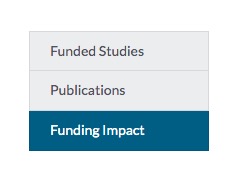
Click Funding Impact in the table of contents on the left (see screenshot below) or simply scroll to the bottom of the page
Under Funding Impact, click View Dashboard—this will direct you to the app*
*Note: Only select admin personnel from your organization have access to this application.
If you think you should have access to projectLIVE, please contact us or the admin group in your organization working with Sage Bionetworks.
The ProjectLIVE app features four modules: Snapshot, Publications, Participating Studies, and New Submissions, which you can toggle between using the menu at the top.

Snapshot module
This module provides a bird's eye view of your organization's funding structure and activity in the funded studies year over year. Through the Overview section and the various bar plots, you can see the total number of studies, files, samples, and publications, by year, and by study.
Please note that you can see more details of each bar plot by zooming in, isolating specific access types, and more. See the section how to use the bar plots below for instructions on how to make the most of these bar plots and get the information you need.
The Snapshot module features the following sections:
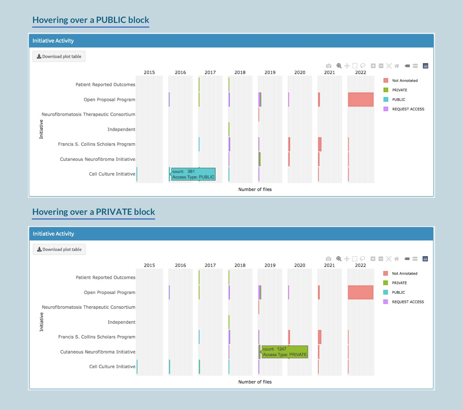
Section 1: Initiative Activity
This section shows a summary of each each initiative as it has generated data through the years—more specifically, it shows how much of the generated data is available to the public, versus how much has private or restricted access.
Each bar in the plot shows the number of files labelled as Private, Public, or Restricted Access. Any files that do not have accessType annotated will be labeled Not Annotated.
You can hover over any of the colored blocks of the bar plot to see the actual count of files (see screenshots below).
Section 2: Resources Generated
This section provides an overview of the various data types generated by year, suggesting the nature of experiments that studies have focused on in a particular year or funding cycle. The plot is ordered such that the data type with the highest number of files in the most recent year will surface to the top of the list. You can hover over any of the colored blocks of the bars corresponding to each data type to see which studies contributed to that data type.
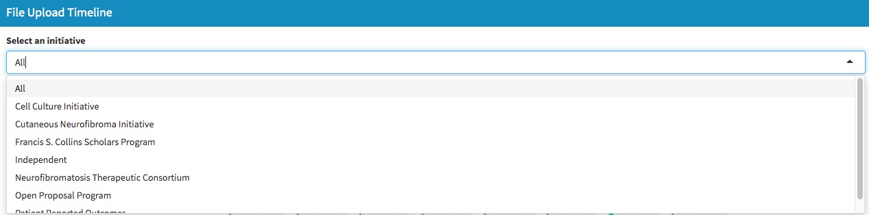
Section 3: File Upload Timeline
This section provides an overview of file upload activity of individual studies in specific funding initiatives over time during their funding period.
Under Select an initiative, use the dropdown menu to select a specific initiative to feature in the plot (the default plot will show all initiatives at once). The studies listed on the left of the visualization will reactively change according to your selection.
Each bar in the plot shows the various resources generated and shared by each of the studies in this initiative, as listed on the left of the plot. The resources can range from experimental data to analysis reports, among others. The legend on the right shows the various types of resources present for these studies.
You can hover over the colored blocks of the bar plot to view the total number of files for that specific resource uploaded in the particular study.
Publications module
This module is designed to provide you with an overview, in terms of numbers, of the recent and past publications from a specific project in your funding portfolio.
Please note that you can see more details of the plot by zooming in, isolating specific access types, and more. See the section how to use the bar plots below for instructions on how to make the most of these bar plots and get the information you need.
The Publications module features the following sections:
Section 1: Publication Status
This visualization displays the number of publications per year. If you hover over any of the colored block
s of the plot, you can see how many publications there were for that study in that year, and the name of the studies that contributed to the publications in that year.
Section 2: Publication Status by Disease Manifestation
This visualization displays the number of publications per year, by disease manifestation rather than by study. You can hover over any of the colored blocks in the plot to see more details. You can also click Download Plot Data to download the counts for each disease manifestation in each year.
Participating Studies module
This module provides a granular view into each of the participating studies in your funding portfolio, which you can filter by initiative, followed by several relevant visualizations to reflect your selected initiative.
Please note that you can see more details of the plot by zooming in, isolating specific access types, and more. See the section how to use the bar plots below for instructions on how to make the most of these bar plots and get the information you need.
The Participating Studies module features the following sections:
Section 1: Participating Studies
This section, in the form of a table, provides relevant details on all studies in an initiative. Notice how you can reorder the table by a specific category by clicking on a column of interest. By default, the displays all studies from all initiatives that your organization has funded. Use the Select an initiative dropdown to select a specific initiative to display only those initiative’s studies in the table. You can also use the search box in the top right to search for your favorite study using the study name or name of the leads.
In order to populate the rest of the visualizations in this module, you need to click on a specific study within the table.
Section 2: Study Summary
This table is a simple summary of the selected study. You can actually click on the synID listed next to Unique Study Id to go directly the study in Synapse.
Section 3: Study Timeline
If there has been any upload or annotation activity in this study’s Synapse project space, that progress will be reflected in this visualization. You can see the number of files uploaded each month, per Resource Type (analysis, experimental data, or report).
Section 4: Data Focus
These plots feature the total number of data files present in this study based on various data focuses of this study: assays used, resources added, species used, and tumor types investigated. You can hover over any of the colored sections in each bar plot to see more details.
Section 5: Annotation Activity
These plots tell you whether the uploaded data files in this study have been annotated or not, i.e., whether metadata labels such as assay, specimenID, etc., have been added to the uploaded files.
In the current plot, we consider any data files that originated from a scientific experiment, but do not have a value in the Assay column, to be Not Annotated.
You can hover over any of the colored sections in each bar plot to see more details.
Section 6: Publication Status
If this study has associated publications, then this visualization displays the number of publications by year. Hover over any of the colored sections in any plot to see more details.
Section 7: Milestone or Progress Report tracker
As mentioned in the app, these series of plots track the expected and actual data uploads to this study associated with each progress or milestone report. Visualizations will only appear if the study has current milestones or progress report updates. To populate the visualization, you need to select a parameter (either Data Type or File Format) from the dropdown menu under Choose parameter to visualize.
Section 7a: Researcher reported progress/milestone update
This section tracks the files uploaded by researchers that they have labeled as being a part of a specific milestone or progress report period.
In this section, you can use the Choose Milestone or Progress Report Number dropdown menu to select a specific milestone or progress report that you want to visualize. The resulting graph will show the expected data files compared to the actual data files that have been uploaded for the study in the chosen milestone or progress report.
Hover over any of the colored sections in any plot to see more details.
Section 7b: Sage internal milestone or progress report tracking
There is a chance that the researchers may have forgotten to add the milestone/progress report number to newly uploaded files. Or, it’s possible that there may be a typo in the entered value that doesn't match the right milestone.
To help scan for these potential inaccuracies, this section provides an independent internal audit of all files in a researcher’s study space within a customizable time window (for example, within a few days or months of an upcoming milestone deadline).
Click on a row in the table below to select the milestone or progress report number of interest. Then, use the slider on the right to determine a time window around the estimated date of upload to find all files uploaded during this window. The resulting data will appear in the plots below. Hover over any of the colored sections in any plot to see more details.
New Submissions module
This module provides a summary of new file submissions, which you can filter by number of days. It has one section that presents the information in a table.
Section 1: New Files
This table shows a summary of all new files uploaded with the last N days. The information displayed in the table is automatically displayed in the visualization below (Section 2: New Submissions Plot).
By default, the table shows the files uploaded within the last 60 days. To see files in a longer or shorter time window, type in a custom number under Display files uploaded within the last N days. Changing this number will automatically update the information displayed in the visualization below.
You can use the Show N entries dropdown to change the number of entries that displays on the page (this does not affect the visualization plot, only the table view).
Section 2: New Submissions Plot
This plot is a visualization of the information displayed in the table above. It displays the number of files uploaded per study, as well as a breakdown of annotations for those uploaded files.
Hover over any of the colored sections in the plot to see more details.
How to use the bar plots
All the bar plots in various visualizations/section throughout the app function in essentially the same way.
If you hover your cursor over different bars on the plot, you can view more information about that bar. For plots that include a legend, you can click on any item in the legend to temporarily add or remove it from the table. You can also double click on any item to isolate only that item in the plot.
There are additional table tools you can access by hovering your mouse over any part of the table—these tools (seen below) will appear as icons at the top right of any plot.

Use the camera icon to download a .png image of the plot
Use the zoom in and zoom out icons to zoom in and out
Use the autoscale icon to rescale the plot back to fit the page after zooming in or out
Play around with the other icons to see if any are of use to you!
You can also click Download plot table at the top left corner of any plot to download a .csv file of the plot data which can be opened using Excel.
How to find a specific piece of information
For additional instructions on specific use cases, see the page Use Cases.